Saturday, November 7, 2009
爸,妈,kor~
你们默默的爱
让我深深的感受到
家的温暖
爸爸那天 在我回来时
说了
“你到哪里了?我们很想你”
哇!这句话深深的刺进我的心里
感觉 感动
妈妈 不会特地打给我
但是 我回答给他
哈哈哈
虽然 他有时会骂我
但是 我们彼此知道
我们是爱着对方的
哈哈哈
肉麻到~~
好了~
到 korkor 了~
korkor 经常会陪我玩娃娃!!
够力
无法想象一个"男人" 玩娃娃的样子
哈哈
很可爱
然后 还会陪我聊聊
学校的东东
虽然 话不多
我家就是酱啦~!
爱 不必说出口
心里知道就好
但是 有时你不把它表达出来
还是没人懂的~~
就像我 哈哈哈~~
恩啦
致 我家人
虽然 你女儿/妹妹不粘家
但是
矮拉夫油 啦~~
哈哈
geli~~
Tuesday, November 3, 2009
Wednesday, September 30, 2009
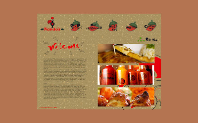
Strategic Brief
This is a final project for web design 2 from The One Academy. This project is require to redesign the existing company website and make it better and looks good. My title is Nando’s, which is a store sell chicken with special sauces that is Peri-Peri. I think this is a long term project but we are using our short term to cover this. It is quite rush yet I enable to manage my time to finish on time. Although might not the best, but I tried my best to achieve what I want. This website’s target audience is person who like FOOD and discover the food a lot.
Nando’s competitor are the fast food and Kenny Roger which is also selling chicken. Based on my research, I found out the food website mostly using red and brown color. And I did research a little bit about the color that why are they using this is just to show the food of color and it looks delicious.
The peri-peri is spicy and yet Nando’s provides customer to choose the level of spicy. The Nando's restaurants have been blazing a fiery trail across the globe and Barcelos Cockerel crowing from
Nando’s, provide good food fast. What is good food fast? They said, good food also can done in “short” time. Eating natural also Nando’s benefits. Their chicken is using grill method.
Tuesday, September 15, 2009

This web is very clear list down everything and is very nice and comfortable to look into~
I can feel the BURN of the chicken... and i found out mostly "chicken selling shop" are using fire color...
KFC website is nice too... because got music provided and very smooth to look into... like the arrangement is good....
This with a home page which is eating with family... Bring out kind of warm feeling... And this also hv it own music... ~ Sing In English Version~~
This is from TGSNT website~ hmmm...i found out the graphic is very nice and cute... and not boring becuz there were some flash element...


Url for web tutorial~
Css Tutorial
UserLand Frontier
About web design
EchoEcho
Url for nice design references~
http://illustrationmundo.com/
http://www.thedieline.com/
http://www.tolleson.com/
http://iso50.blogspot.com/
Url for design tutorial~
22Photoshop Web Design Interface Tutorial Sites
Illustration tutorial
Web design idea and tips
Graphic design
Design river
Tizag
Good tutorials
Photoshop tutorials


